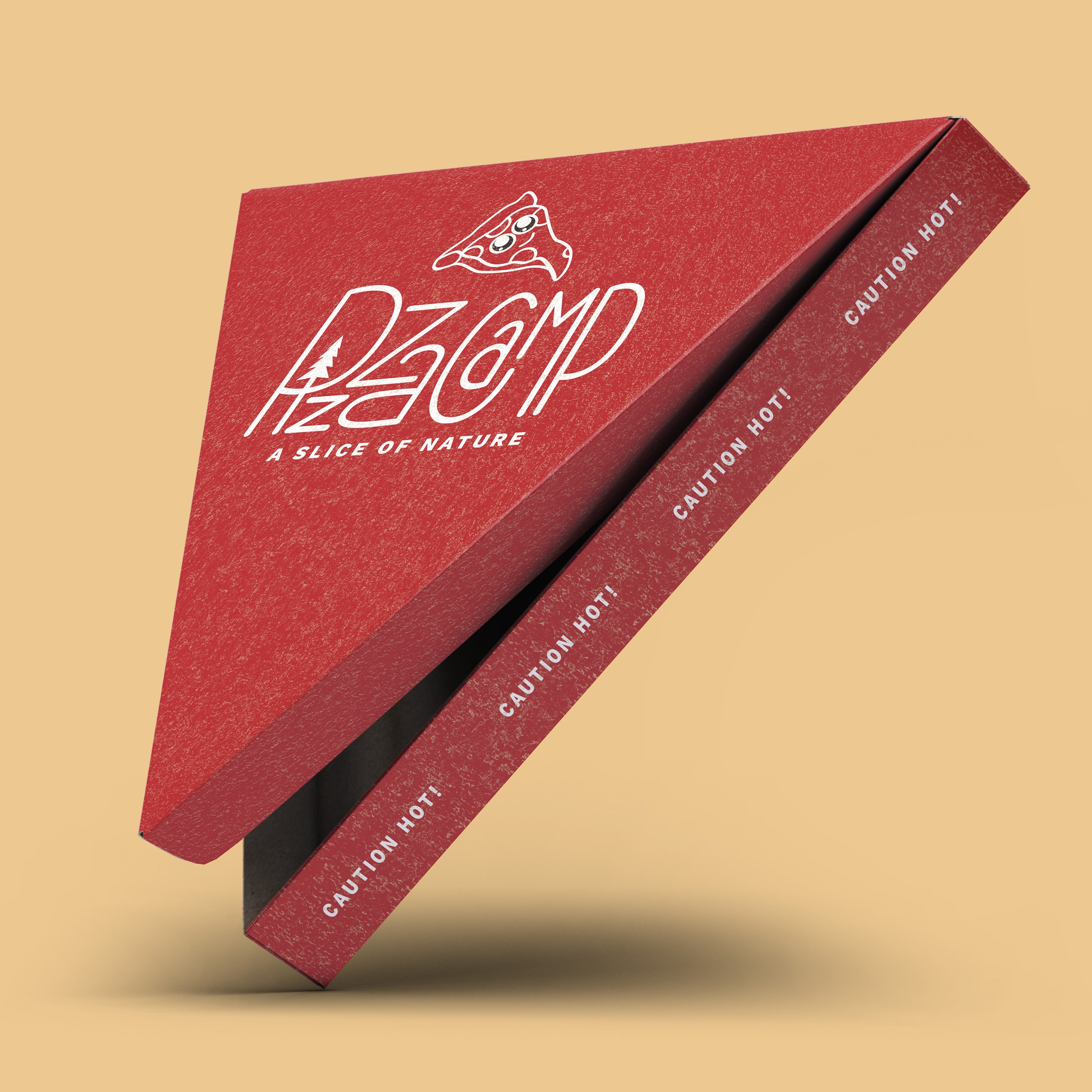
Pizza Camp
LOGO | BRAND IDENTITY | PACKAGE DESIGN
About — Brand Identity Concept
Pizza Camp is a food truck that is all about the nature of Seattle, WA and most importantly, pizza. The illustrative pizza character and hand lettered typography allows the brand to be more fun, inviting, and comforting to its audience.
Primary Logo — The Pizza Peel
After designing the typography for the logo, I felt it needed to be contained in a shape that felt appropriate for what is being marketed. After trying different shapes, the peel was discovered. It fit effortlessly with the way the typography is stacked and bouncy.
Menu Design —
Minimal layout with attention to alignment and the red text brings attention to the most important information.
Food Truck —
Screams PIZZA! The red exterior is striking but not overwhelming. The vibrant brand identity is extended to the food truck to solidify the playful energy that Pizza Camp embodies.


